Task
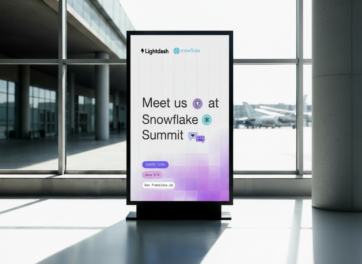
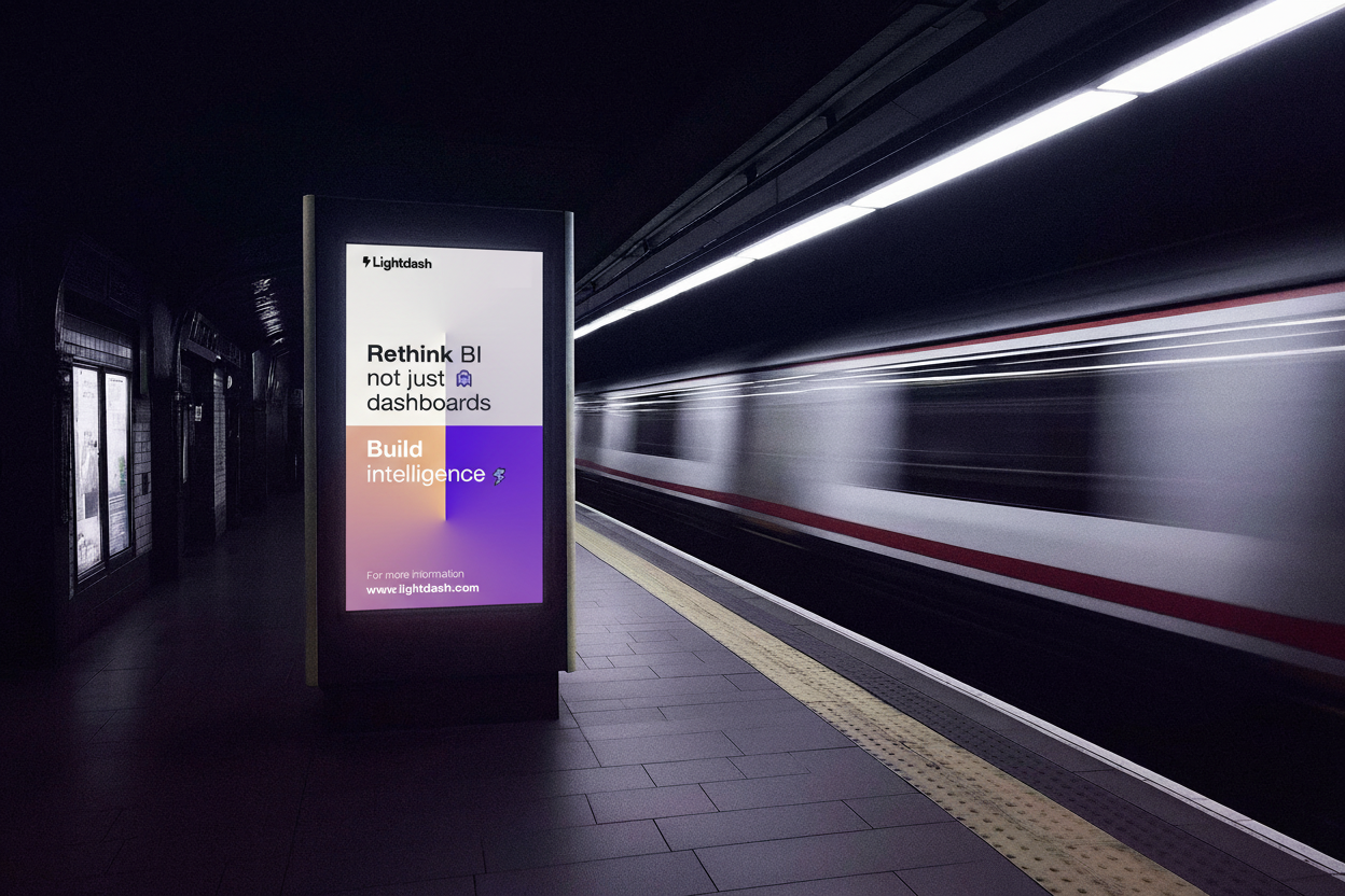
Lightdash is launching in Japan! We are running our first Tokyo community events and want a bold, playful campaign direction that feels unmistakably Lightdash while celebrating a new territory. This task is about understanding your visual exploration process: the ideas you generate, the assumptions you make, and the kinds of questions you would ask if this were a real project.
Creative Direction
Think of this as a sub identity: you can push into new territory, experiment with colors, cultural references, or motifs, but it should still feel like Lightdash at its core (pixel, glitch, playful energy).

Let’s dive into Tokyo’s culture
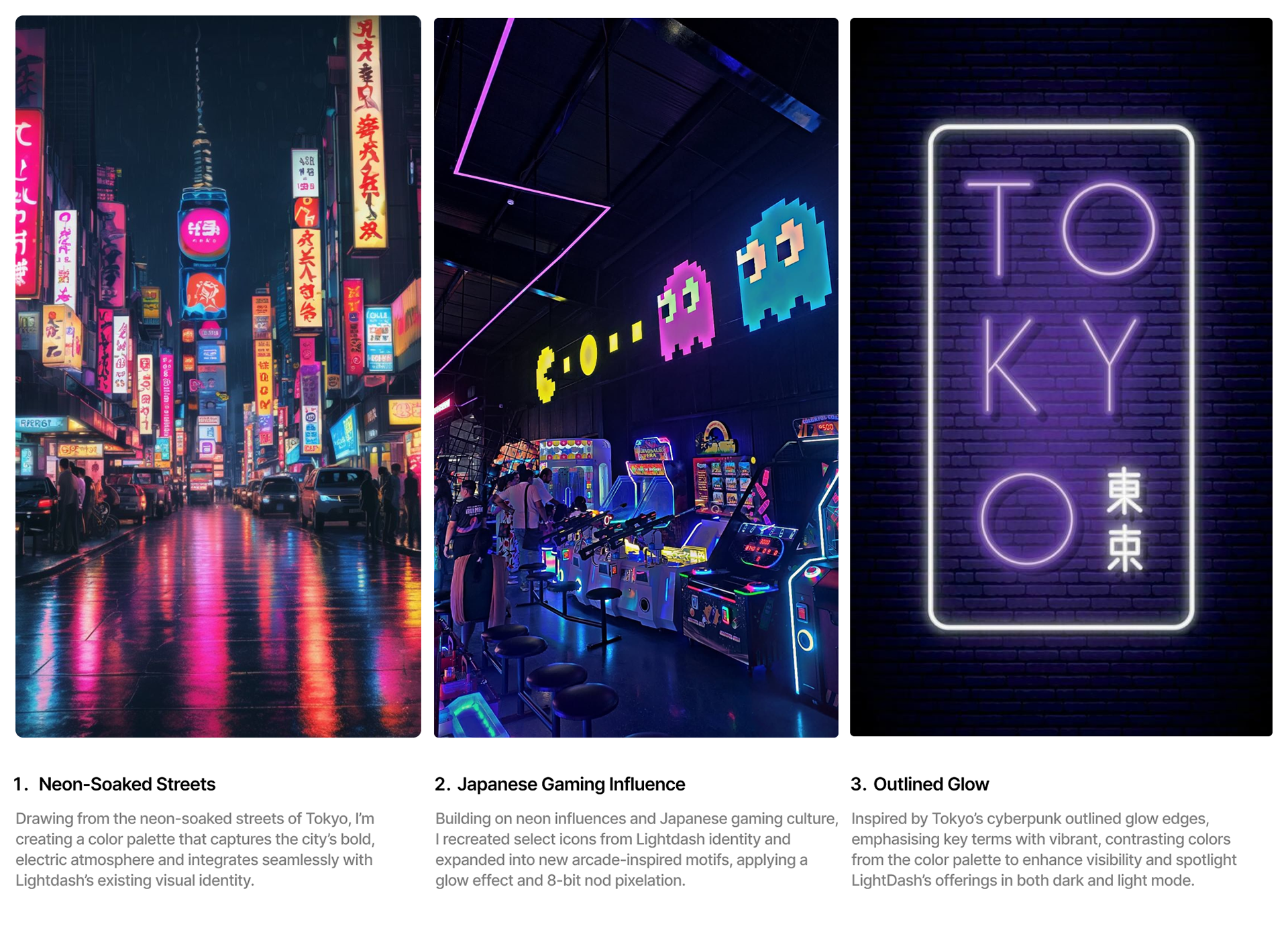
As LightDash’s community event will take place in Tokyo, I’d like to dive in deeper into the city’s deep and complex relationship with cyberpunk, in “high tech, low life” aesthetics with unique Japanese cultural motifs creating a distinct, recognisable style where traditional and futuristic imagery collide against a backdrop of dense urban life and advanced technology. This visual language is echoed in the city’s gaming culture, neon-soaked streets, bold color palettes, and expressive typography.
Questions I’m looking into:
Questions I’m looking into:
1. What visual elements define Cyberpunk in Tokyo, Japan and how it aligns with LightDash’s existing visual identity?
2. Which aspects of Japanese gaming and street culture translate well to a global audience, and which should remain subtle to avoid visual overload?
3. How can these visual elements scale across different touchpoints, from marketing assets to product UI, while remaining cohesive?
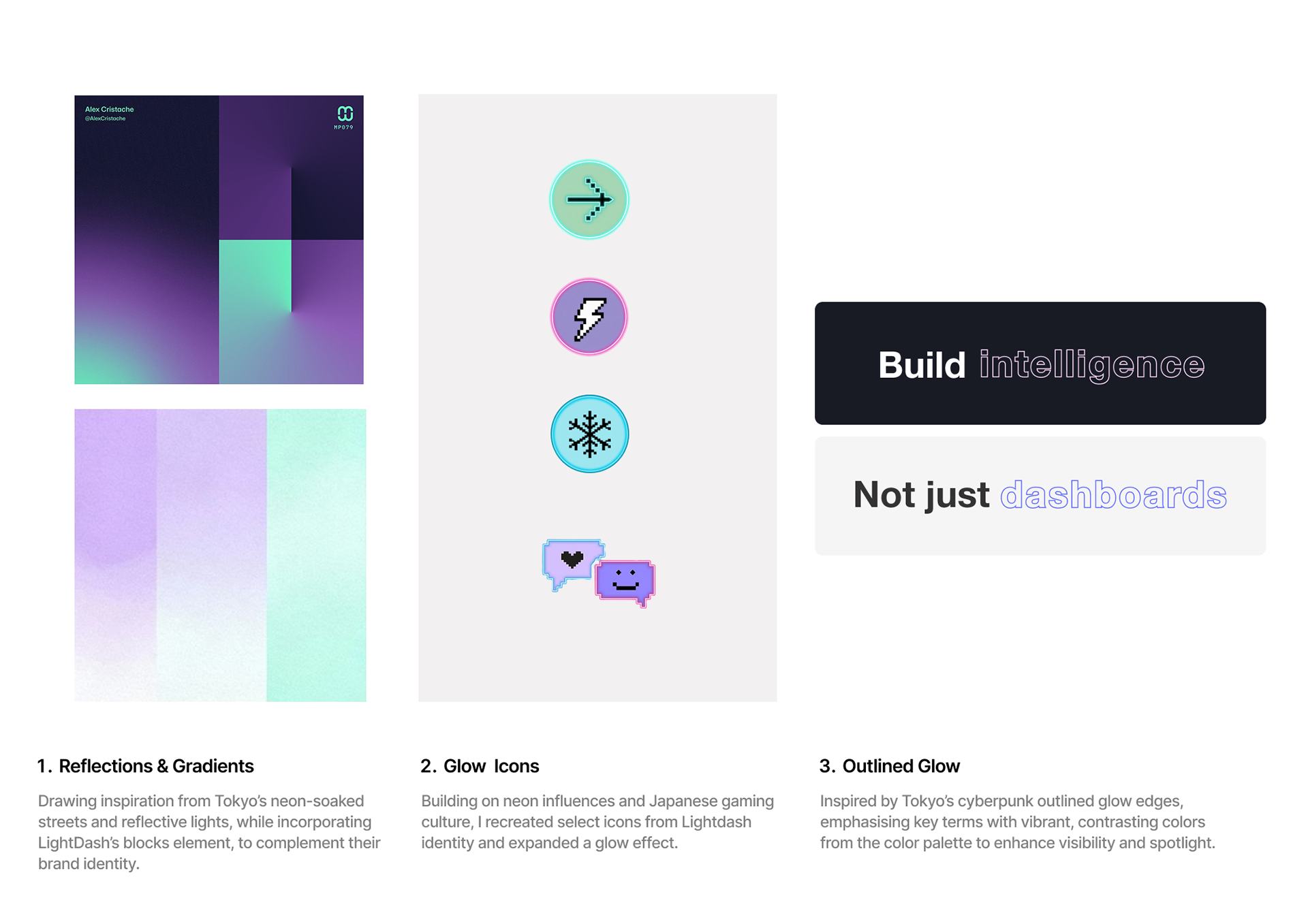
Key Visual Elements
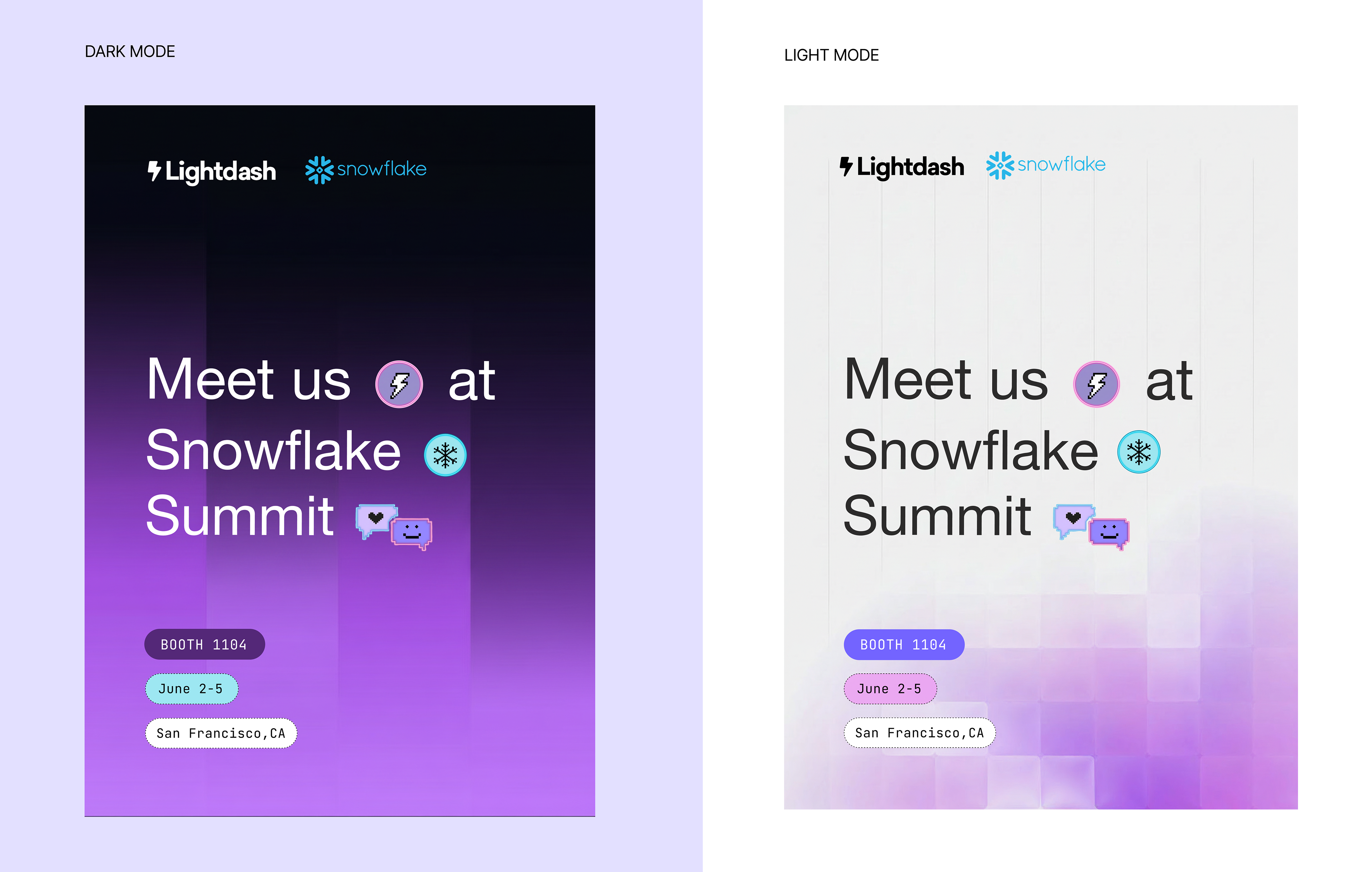
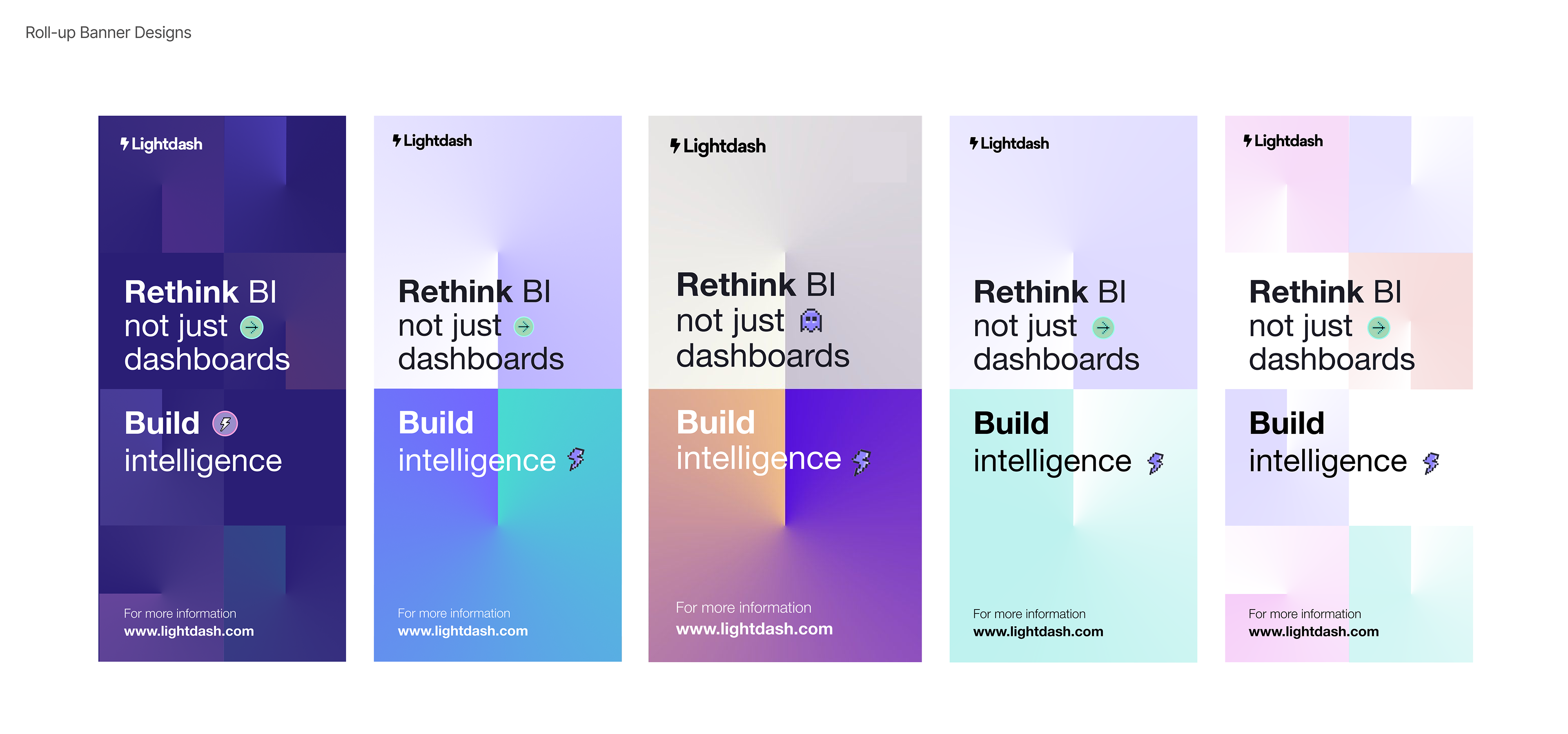
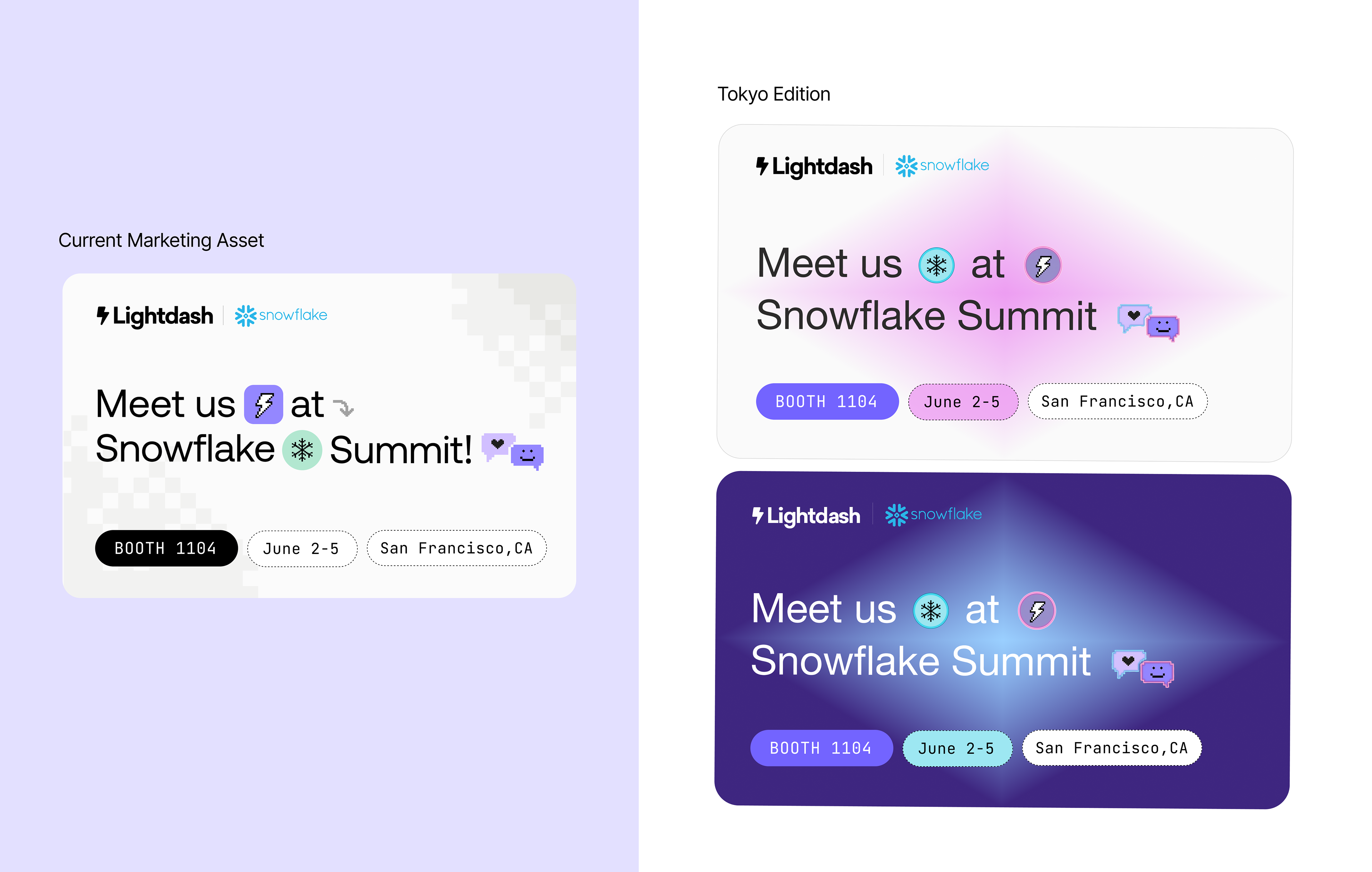
Based on this research, these are the key visual elements that I believe align strongly with LightDash’s brand identity and will bring the Tokyo edition together cohesively.